
This is Pantone 15-5519, or Turquoise to you and me. I have an abiding memory of our front and back doors being painted turquoise when we first moved into 36 Dunstall Walk in the spring of 1964. I say 'abiding' because I'm not entirely sure, but this is the colour in my mind's eye when I think back to that time. It certainly wouldn't surprise me if the doors were in turquoise because this was one of the colours of the early 1960s, and a natural 'up-to-date' choice for a provincial but ambitious and modern estate. We might associate such intense shades with the psychedelic, slightly later 1960s, but turquoise, along with fuschia pinks, limes and tangerines, first appeared in the 50s, and were particularly used as 'Contemporary' accents against 'neutrals' such as concrete, wood, stone and - yes! - pebbledash.
These were the days when you rented your house from the local council, and when 'the men' from the council 'works department' periodically (every four years or so) came to redecorate all of your exterior paintwork, on the basic stipulation that you accepted the colour you were offered (generally from a choice of two).
All of this might seem incredibly prosaic, arcane even, so let me give this some social context. It is easy to forget within today's privatised and increasingly self-absorbed society that people were once excited, as we were, about moving into a brand new, 1960s modern, local authority-provided home, and that this produced many shared everyday experiences and memories. This is what Alison Twells has to say about the painting of council house doors on another East Midlands council estate in a post entitled The ancestral home from her ace blog, Socks for the Boys!:
I stop my mum. I want to know the colour of the front door, and she knows why. We laugh. Council house front doors interest us more than they should. For the first fourteen years of my life, we lived with my grandparents in a postwar Nye Bevan beauty of a house on a big corner plot round the corner from Moira Dale. When the men from the council arrived every few years to re-paint the front door, giving the tenant a choice from one shade each of blue, red or green, my gran would choose red (for Labour!) and then, in her own small protest at this excess of local authority uniformity, would get her paint-brush out the following day.
‘Did she ever just ask them not to paint it?’ I ask.
‘Oh yes, but they had to. They knew what she’d do. Nobody batted an eyelid when she got that olive green tin out’.
Naturally, there are differences here to our experience on the Middlefield Lane estate - especially in the way that Alison's gran got her favourite shade of olive green out and did it for herself anyway once the council had gone. I don't remember us having any grave objections to the colours we were offered. We liked consensus, and I certainly used to enjoy the little expectancy of seeing what colour the doors would be next (it was very exciting for all the kids on the estate to see an army of painters descend upon the place). The other difference lies in the choice of colours - of a more traditional palette in the 1940s and early 50s before the gaudier hues of the 1960s. Either way, the colour of our respective front doors, painted 'for free' by the local council, came to be emblematic of the sense of pleasure we all got from our council houses back then.
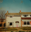
And what colours! First the ‘Contemporary’ turquoise blue. A bright, 'day-glo' orange came next 1968-69ish, and then the pink you see in the c.1975 photo of my house at the top of this blog. The colours change with the times - the pink could be seen as being representative of that early to mid 70s Glam/1950s Rock and Roll revival (think early Roxy Music and, if you must, Mud and The Rubettes). From 1979 and into the post-modern Thatcherite 80s of Brideshead Revisited and so on, I recall a number of heritage colours, when burgundies and racing greens became the norm.
There are still one or two original doors to be found on the estate amongst all the days of yore-style uPvC doors. Here's one seated nicely under its original concrete canopy:

I need to find out from ACIS, the estate's management company, why some of these original features have been kept - whether it was deliberate in order to retain the original feel of the estate, or whether these are the homes of long-standing tenants who want to keep things as they were. At the moment this door is in a nice, satisfying Doc Marten-like ox-blood shoe polish colour. But I wonder what lies beneath? One of these days, I will get some research funding to do all of this properly, and one of the first things I'd like to do is to get my University's Conservation and Restoration people to do a paint analysis of this door, in the hope that it would reveal a wonderful colour-chart of the estate's history.
How did I miss this? Fabulous! And what colours! I love the day-glo orange and glam-rock pink. I remember some of the newer houses in our village having turquoise front doors, but I can't place when that would be. Your suggestion of psychedelic 60s sounds right, but it must have been popular for longer (if only because I am that bit younger than you). I thought for a while that they were painted in rote fashion - you got blue if you were the house after the green one - but my mum assures me there was definitely a choice. I don't remember any other objections to council uniformity but this one rule clearly rubbed my gran up the wrong way.
ReplyDeleteThanks Alison. I think there is an element of high fashion colours taking their time to reach the provinces, getting there later and being around for longer. We did have two colours and they were used alternately on each house as you suggest. I know someone who worked for Johnsons Paint and he once gave some really interesting reasons as to why cars were painted certain colours over time - I'll get in touch with him to see if he knows anything about council house colours. Paint! What fun! Who'd've thought it!
ReplyDeleteA paint anorak writes:
ReplyDeleteI've been in the paint & coatings industry for almost 30 years, Ian. One thing I'm sure of, your door would not have been painted in Pantone 15-5519, or, indeed, Pantone anything. You see, Pantone is an Inks standard, and for reasons that are too technical to go into here, the Pantone standards don't always work for paints. In the 60's your colour would most likely have come from one of the BS Standards - perhaps BS 2660, BS 4800, or most likely, I feel, BS 381C.
Thanks for this Allen. I recall you writing something really interesting on flickr about changing trends in car colours, and thought of you when I wrote this. I know Pantone is to do with printing and my use of this was by way of illustration of the nearest thing to the turquoise I remember. So do certain colours have their own BS number, or are they of paint types? I wonder how much changing trends have an influence on the development of paint colours, or whether newly developed colours have an influence on trends?
ReplyDeleteAn industry secret here, colour "trends" are often manufactured by the coatings industry. In the 1990s it became possible to make silver cars that were truly stable, and would remain "silver" for years. The industry pushed that to the manufacturers and suddenly every other car was silver. Likewise in the 80s with red. Also there have been sudden unexplained resurgences in the popularity of white cars, oddly coinciding with times when white pigment prices were at all time lows.....
ReplyDeleteThe BS standards I quoted are all colour "books" - like the Pantones - with specific colours in them.
Thank you for sharing this interesting and informative article, painting with airless spray gun will be faster and more interesting!
ReplyDelete